Buy Our Advanced Data Visualization Services for Interactive Dashboards
Graphics are an excellent approach for exploring data and are essential for presenting analysis findings. Data visualization is crucial to data processing as it helps identify outliers, discover trends and relationships between variables, and present results. Should you be looking for experts to compose an illustrative presentation of your data, our data visualization services consultants provide tailored solutions for our clients in any field of research. We use features such as charts, graphs, and maps to summarize large amounts of data and compile it into an understandable format. This article highlights the data visualization services we provide, including dashboard development, report writing, and data visualization consulting services. Additionally, we have included the types of data visualization offered by our experts and the software tools we utilize to compose graphics for our customers.
What is Meant by Data Visualization?
Data visualization is the graphical representation of information using interactive visuals that demonstrate the patterns and trends in data and relationships between variables. Visualization is a crucial process of data analysis and reporting because it is used to reveal: i). unusual distributions of data, ii). patterns and correlations between variables, iii). missing values, and iv). data gaps. If you are searching for expert support in data visualization, we assist our clients in conveying the critical concepts of their data using intuitive and simple visualization tools and techniques.
Why Get Data Visualization Services From Our Consultants?
Our consultants deliver customized services to our customers in multiple fields of research, such as sales and marketing, finance, healthcare, and geospatial science. We assist individuals, students, businesses, companies, and organizations in composing exceptional visualizations that clearly illustrate their data, enabling easy interpretation. With access to advanced tools such as R, Tableau, Python’s libraries (Matplotlib, Seaborn, Plotly), and Power BI, our specialists create dashboards, compose graphics, and identify patterns in data.
When providing data visualization consulting services, the first step followed by our professionals is identifying the problem to be solved by recognizing the Key Performance Indicators (KPIs). In the second step, we select a visualization strategy that will fit the target audience. The third step involves choosing the most appropriate chart type based on our client’s data. Examples of visuals we create for our customers include tables, line charts, pie charts, tree maps, heat maps, and scatter plots. We then personalize the illustrative representation of our client’s data to be understood by the broadest possible audience. Some of the solutions we offer include:
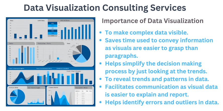
Data Visualization Services Offered by Our Consultants
1. Dashboard Creation Services
A dashboard is a type of data visualization where crucial measurements, trends, and patterns derived from data are illustrated visibly. When providing dashboard creation services, our experts integrate data from multiple sources so the reader can easily understand and interpret the information. We include elements such as data sources, charts, graphs, tables, KPIs, and insights to help our clients understand specific points of interest, explore certain areas, or make key decisions.
2. Geographic Information Systems (GIS) Mapping
GIS mapping involves visualizing spatial data to enable the exploration of patterns, trends, and relationships across various locations that may not be readily visible. By hiring our experts for GIS mapping solutions, our data visualization consultants assist our clients in developing visually compelling and interactive maps. Through pattern identification across different locations, we enable our customers to understand data easily.
3. Report Writing Services
Our experts provide report-writing services by selecting the most relevant data and presenting the results in a clear and visually appealing manner that is easy to comprehend. Through the application of tools such as Tableau, we create comprehensive reports used by our customers to monitor, track, and evaluate their data.
The data analysis report we compose typically comprises the introduction which contains a summary of the research and background data. The report also has a body that highlights the methods used to analyze data, the results of the analysis, and a conclusion that demonstrates how the research addressed the initial questions. We include comprehensive and appropriate visualizations in the data analysis section to enable our clients to understand their findings easily.
4. Data Visualization Consulting Services
Professionals from our company offer data visualization consulting services to provide specialized guidance on the data visualization type to employ based on our client’s research objectives. Based on our experience in helping clients in different fields of research, we apply our expertise in the identification of the most suitable visual type and apply it to achieve the desired research aims. Reach out to us today for specialized help in data visualization.
Types of Data Visualization Services We Offer
1. Temporal Data Visualizations
Temporal data is information related to different time instances. Our experts assist in creating temporal data visuals for our clients to understand patterns, trends, and anomalies over time in the data collected. We assist our customers in comprehending time-dependent variables and conduct predictive anaysis to forecast future occurrences through developing graphics such as line graphs, Gantt charts, stream graphs, and heat maps.
2. Geospatial Data Visualizations
Geospatial data visualizations are used to highlight the relationship between data and its physical location. We assist our customers in visualizing complex spatial data by combining data from multiple sources on one map to reveal useful insights. By composing geospatial visuals such as proportional symbol maps, our experts provide professional help to clients, enabling them to identify problems in data, track changes, understand trends, and perform predictions related to different geographic areas.
3. Hierarchical Data Visualizations
Hierarchical data visualization involves presenting data in an organized tree-like structure where each node in the data has a parent-child relationship. Through the development of visuals such as tree diagrams and treemap diagrams, we provide expert help to our clients in organizing complex data sets into structured and layered graphics for simplified comprehension. With hierarchical data visualizations, we assist customers in navigating through different levels of advanced data.


Software Tools We Use While Providing Data Visualization Consulting Services
Our experts utilize R, Tableau, Power BI, and Python libraries when conducting data visualization for our customers. For Tableau, our professionals provide specialized assistance in data visualization by making thematic maps to display spatial data, composing time series plots, creating infographics, or generating exceptional presentations of massive data sets. We apply multiple large data sets to develop charts in interactive dashboards enabling our clients to easily identify patterns in data.
R offers a variety of packages that are used in data visualization, some of which include ggplot2, plotly, rmarkdown, patchwork, hrbrthemes, and paleteer. Through our data visualization services in R, we assist clients in discovering relationships among variables, patterns, trends in data, and anomalies and outliers in data.
Our data visualization consultants utilize Power BI to develop real-time data dashboards and interactive reports, charts, and graphs for business owners. By creating visuals such as pie charts, line charts, ribbon charts, and KPI visuals, we help clients draw valid conclusions that they can use for informed decision-making. Using Power BI, our experts also create customizable reports that illustrate business data insights in-depth.
Major Python libraries our data visualization consultants apply are Matplotlib and Seaborn. Our experts utilize Matplotlib to assist our clients in developing 3D plots for demonstrating complex relationships, creating basic plots including line plots and bar charts, and statistical visualization. With Seaborn, we create highly customized visualizations of data enabling easy understanding and exploration of data for our customers.
Why do Our Experts Deliver the Best Data Visualization Services?
Our professional data visualization consultants have years of experience providing exceptional services to our clients in different disciplines. We apply this background knowledge in handling simple and advanced data visualization processes to deliver exceptional graphics, dashboards, and reports that demonstrate the trends and patterns in data. Additionally, our specialists have expert-level proficiency in data visualization tools and apply the most suitable one based on our customer’s research objectives.
Summary
This article contains an illustration of the data visualization services provided by our specialists. Composing highly interactive dashboards and visuals that clearly demonstrate the patterns, trends, and relationships in data requires knowledge and skills of the software tools and data visualization techniques. Need help with data visualization? Our company has the best consultants for the job. Translate your data into easily comprehensible graphics by hiring our professionals now. Talk to our experts today via our live chat to learn more about our services. You can also fill out our Contact Us form or email us for any inquiries about data visualization services. We are available 24/7 to ensure we serve you at your convenience, at any time.